3 min read
Automating a weekly KPI report: the pagination bug that makes reports quietly wrong
Automated weekly reports save hours, but one that reads only the first page of an API looks fine and is wrong. How to build a report you can trust.
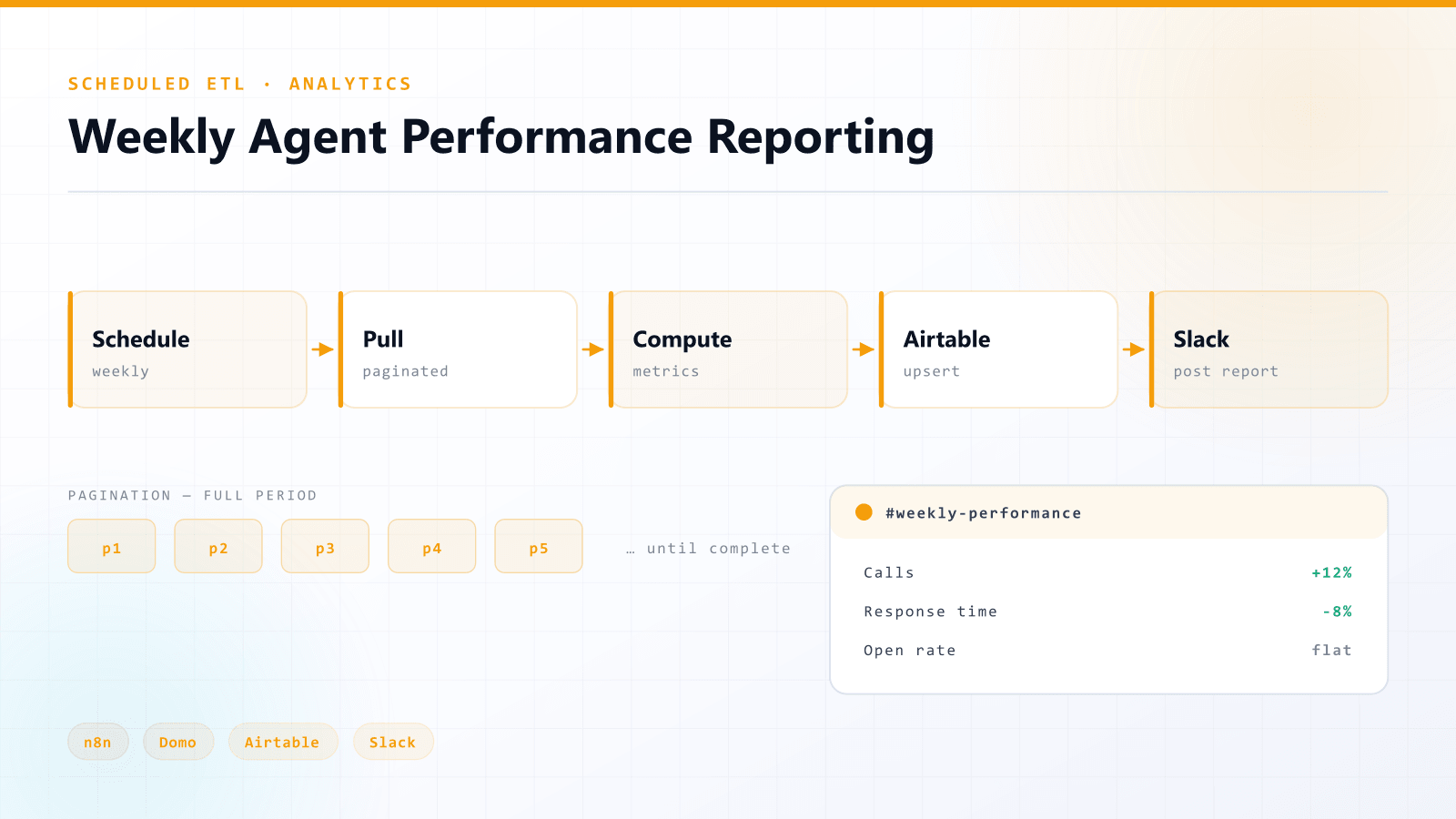
Short answer: a weekly KPI report can run entirely on a schedule. It pulls the data, computes the metrics, stores the history and posts a formatted summary where your team already works, such as Slack. The most common way these reports go wrong is pagination: the report reads only the first page of an API response, and the numbers look plausible while being incomplete.
I built this kind of reporting workflow in production. Here is the structure, and the checks that make the numbers trustworthy.
Why automate a weekly report?
Weekly reporting is the kind of task that quietly eats a person's time. Pull the data, page through it, recompute the same metrics, paste the result somewhere people will read it. Then do it again next week, and hope the metrics are defined the same way as last time.
Automating it gives you three things:
- It runs without anyone remembering to run it.
- Metric definitions stay identical week to week, so trends mean something.
- History accumulates in a store you can query later, instead of living in old Slack messages.
What does the workflow look like?
- Schedule: the workflow runs on a fixed weekly cadence.
- Paginated pull: activity data is retrieved page by page until the full period is covered.
- Metric computation: weekly metrics are computed the same way from the complete dataset.
- Upsert to storage: results are written to a table (Airtable in my case) using an upsert, so re-running a week updates it instead of duplicating it.
- Deliver: a formatted report is posted to Slack.
I built mine in n8n, pulling from a BI platform's API, but every step maps onto any scheduler and any data source.
Why is pagination where reports go wrong?
APIs rarely return everything at once. They return a page of results and a way to ask for the next one. If a workflow fetches one page and stops, nothing errors. The report renders, the numbers look reasonable, and they are wrong.
This is the most dangerous kind of bug, because it looks exactly like success. A report that silently reads only the first page is worse than no report, because people make decisions on it.
How to guarantee completeness:
- Loop until the API says there are no more pages, not for a fixed number of pages.
- Compare the number of records you received against the total the API reports, when it reports one.
- Check the timestamps of the first and last records cover the whole reporting period.
- Alert when a week's volume is far outside its normal range. That is often the first sign of a broken pull.
Why upsert instead of insert?
Reports get re-run: a failed run is retried, or late data arrives and the week is recomputed. With plain inserts, every re-run adds duplicate rows and inflates the history. An upsert keyed on the reporting period and entity means running the same week twice gives the same result.
Why deliver to Slack instead of a dashboard?
Because people read Slack. A dashboard is the right home for exploration, and the stored history can feed one. But the weekly summary works best where the team already is, formatted to be read in thirty seconds.
Checklist before you trust an automated report
- Does it fetch every page, and can you prove it?
- Are metric definitions written down and computed in one place?
- Is re-running a week safe?
- Will someone be alerted if the numbers are suspiciously low, or if the run fails?
If you can answer yes to all four, the report can run without supervision.
Frequently asked questions
- How do you automate a weekly KPI report?
- Run a scheduled workflow that pulls the full week of data, computes the metrics the same way every time, upserts the results into a table so history accumulates, and posts a formatted summary to Slack or email.
- Why is my automated report missing data?
- The most common cause is pagination. APIs return results a page at a time, and a workflow that fetches only the first page produces a report that looks normal but is incomplete. Loop until the API reports no more pages, and check record counts against the total.
- Why use an upsert for report data?
- Reports get re-run when a run fails or late data arrives. An upsert keyed on the reporting period updates the existing week instead of adding duplicate rows, so running the same week twice gives the same result.